Software engineers everywhere are rejoicing that pixel-perfect development is dead. A google search for ‘pixel-perfect’ returns dozens of similar articles. While this has always been point of contention between software engineers and visual designers, this recent pronouncement of death is in reference to the rising complexity of display environments. This raises the first question: is visual accuracy in UI development really impractical?
This article addresses the components of a great handoff. In other words, the things that a designer really should be able to hand a developer if they expect the final product to be visually consistent with their designs. However, we first need to talk about industry standards regarding device-agnostic design for flexible content, and what that means for both designers and developers.
Unpredictability & Intentionality
Many things in the visual rendering of a site or web-app will change depending on the device and browser. The mobile-first design philosophy rose to popularity because it stated that appearance, features, and functionality should be optimized for the lowest common denominator and progressively add enhancement as screen size and browser capability improved. Responsive grids like bootstrap, flex-box, and now the CSS grid allow for content to mold and shape itself to every environment. Fonts and text are rendered differently between browsers, and the display of multimedia can depend on many factors including aspect ratios, pixel density, and even assistive tools like screen zoom.
From this list of arguments, the conclusion is often made that ‘pixel-perfect development’ is now either 1) impossible, and / or 2) a waste of time given that few people will ever see the content in that single environment. I would be forced to agree if we use a narrow definition that says “this digital product must always look like these designs in every circumstance”. However, this depends on a false presumption. The argument against pixel-perfect development is a straw-man that assumes designers cannot accurately anticipate different scenarios and circumstances.
The argument against pixel-perfect development is a straw-man that assumes designers cannot accurately anticipate different scenarios & circumstances.
The most simple rebuttal is that every top app in the app-store, and most enterprise web-apps with any significant competition, probably do line up nearly perfectly in most circumstances to the design mockups. They achieve this through a combination of great design work, comprehensive handoffs, exhaustive quality assurance to fix errors before release, and iterative improvement over time.
Mutual Respect
The core of this conflict is often tied to visual designers who aren’t interested in understanding code and developers who don’t value design. The truth is that ~both design and code standards are rising all the time, and the accumulation of small discrepancies in quality on either front often destroy user experiences and sink great products.~ *Adobe cough cough*.
It’s unrealistic to expect designers to perfectly anticipate changing content or changing environments before they get into the code, even if they can indicate their design intention for the majority of them. The real problem arises when they accuse their developers of being ‘unable to make it correctly the first time’, rather than seeing modification as a part of the process of creation. For this reason, developers everywhere have learned to push back and demand flexibility to modify the design implementation.
On the flip side, I’m blow away by how often I interact with Sr. Developers who defend uncentered icons, mismatched margins, and disproportionate logos. I reject the idea that this is consistent with industry standards, or that visual accuracy is a waste of expensive time and resources. Both of these attitudes are equally destructive, and prevent a team from producing great work.
Both design and code standards are rising all the time, and the accumulation of small discrepancies in quality on either front often destroy user experiences and sink great products.
Very few designers will have a comprehensive understanding of CSS grids. I’ve also never met a competent front-end developer who has memorized The Elements of Typography and implemented it mercilessly through CSS (although I’d be interested if someone wanted to create a CSS framework with me!) Instead, individuals from these two sides must value their interdependent fields and rely on each other.
How Close is Close Enough?
To cope with this question at Parchment, we implemented 4 levels or implementation standards. The first level is basically a DIY user story where a Jr. Developer could be handed acceptance criteria and our design system and then be left to their own devices. The emphasis was functionality. On the other end, the fourth level was anal retentive to the degree that CSS + Javascript prototypes for interaction were created and a huge number of mockups were provided for different break points. During QA, a screen shot of the code with the exact content and screen width was expected to line up perfectly as an overlay in Photoshop in every respect with the exception of font rendering.
Is pixel-perfection possible in every circumstance? Well, teah. I work with developers who do it all the time. I’m not even a great front-end developer and I can do this. Is it worth it? Sometimes. Maybe even often. It depends. Today, we’re not going to talk about the highest level of perfect reproduction in every circumstance. We’re going to look at the most common handoff we used. We were shooting for code that was pixel-perfectly in an ideal scenario, and gracefully accommodated many alternative scenarios with visual accuracy to design intention. Now that we’ve acknowledged the debate and defined reasonable expectations, let’s talk about methodology.
Project Example
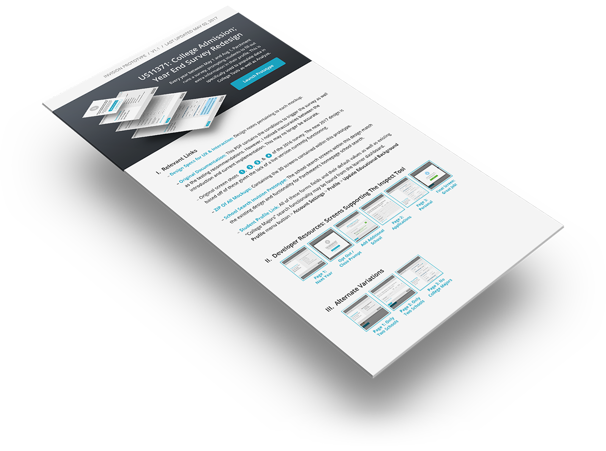
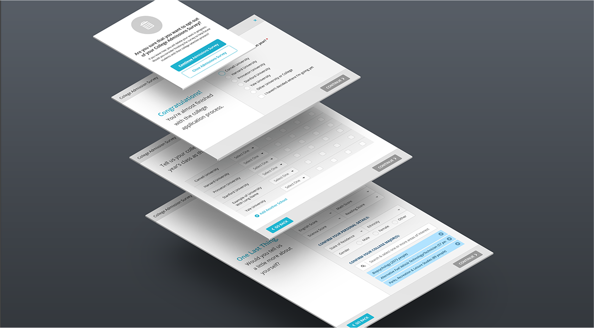
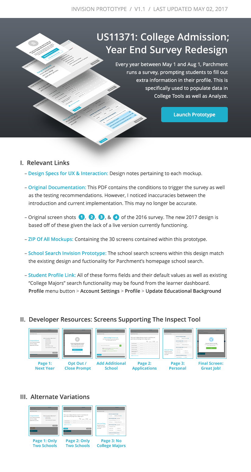
We’re going to look at an actual project for a relatively straight forward user survey that I did in about a week at Parchment. Everything is hosted from the prototype launchpad on InVision :
OPEN PROTOTYPEIt might be helpful to have a little bit of context. Parchment is a company that sends the majority of digital transcripts between education institutions every year. The project overview is that we had a college acceptance survey that appeared every year for students on their dashboard after the major transcript season had passed. It was important for Parchment as a business as they used it to calculate all kinds of data and analytics, but it was also about to play an even bigger role in a new product we were launching called Parchment Analyze that would provide key information for admissions counselors around the country.
The Method
We're going to walk through everything in the above handoff. There are a few links in the launchpad that I no longer have access to, but most of them should work.
I. A place for everything to live:
This is a touchy subject. At the time, we were juggling three kinds of project management software. The entire product team used Asana for User Stories and planning. The 30 people on our development team managed sprints and documentation using Atlassian. Our design team used Monday.com to manage our design queue with priorities, status, resources, and dates because Asana couldn’t do it. This meant that any given project had resources strewn across software platforms, emails, instant messages, google drive, and the occasional thumb drives.
For me, everything around a handoff centers around the prototype, so I consistently find it easiest to dump everything into a ‘launchpad’ at the start of a project and keep it updated in the prototype using InVision. When I say launchpad, it is basically a photoshop template that I draw links on top of.
Once the project is done, I download the prototype file in a .zip, and attach it to the user story as well as copy/paste the text and links in. It takes a little bit of time to do it this way at the end of a project. (Maybe an hour?).
Why advocate for the launchpad when it’s more work? It’s super simple really. Having the resources, specifications, flows, and thumbnails (everything design related) live together in the prototype means developers use them. When you package it up and need to reference it a year later, you’ll have everything you need.
II. Visual designs for up to three device widths:
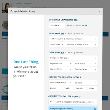
We’re talking about mocks. We used the InVision plugin to sync them automatically whenever we created updates, and this allow developers to use the Inspect Tool. If you’re not familiar with it, developers can hover over anything in the design and it supplies CSS, defines sizes and distances, and is able to generate resources at x2 resolution.
In this project, we were talking about modal windows. For this reason, we only supplied one device width because our max width was still tablet compatible. This was a philosophy we applied to all of the forms in all of our flows because, frankly, wide forms a terrible and it saved a lot of time. For page designs, this wasn’t nearly sufficient.
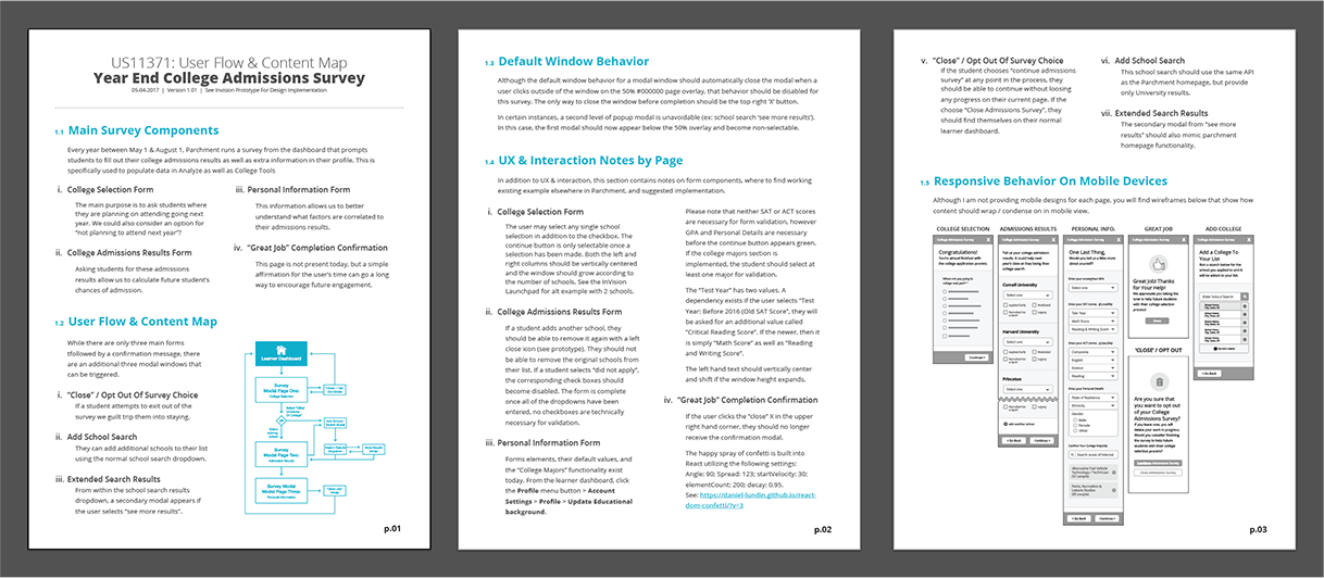
We still provided responsive wireframes for anything that didn’t receive a direct mockup. Our expectation was that developers would be able use these wireframes to judge layout and content behavior at other widths. This was combined with best practices, the supplied mockups, and the Parchment Design System. Was this always perfectly predictable? No. But it did give our software team the flexibility they needed to implement it correctly. Did it save us a lot of time? Yes! Now for the harder question: do I think this still qualifies as pixel-perfect design? I do! Every page element is extrapolated from supplied designs, whether this project or the design system, even if widths and content are variable. That’s a huge win!
III. Specs for each page:
This addresses several key points. The first is behavior, for example anything specific to responsive designs, when it appears, data decencies and what it does without that information. The second is states, for example content such as a list with 1 vs 9 items, wrapping titles, and so on. The final is interaction, which include things that happen in response to a user action, in this case the dropdown search, hover states, and final notification of completion.
IV. Click-through prototype demonstrating flows:
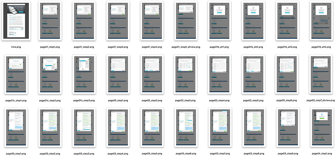
We also used InVision for click-through prototypes to show how different flows and scenarios played out. This is all pretty straight forward in the software world, but I would say that a lot of small to medium agencies are still figuring this out. In this project, there were 30 screens for 4 pages to show the different flows and states that were possible.
V. Documentation and references:
Supporting documents lived as links in the launchpad. In this example, this redesign links to screenshots of the 2016 survey since the previous version was not live.
Outside dependencies were included as well. In this case, it referenced our school search API and a few modifications necessary to make it function in this context.
Support It
This should be self explanatory, but it needs saying. Followup is necessary. When you deliver a user story and check the ‘complete’ box, you aren’t done supporting it. Here’s a simple way to make sure you don’t drop the ball: Once you’re done set reminders on your calendar to follow up with your developers casually (but don’t tell them you did so or turn it into a meeting). It takes maybe 15 minutes to stop by someone’s desk and ask the following questions:
- What was the most time consuming?
- What seemed nit-picky?
- What could you have imagined being better or more simple?
- Is there anything you need that you don’t have to get this done at a level you’d be proud to show off?
Will this result in more work for you? Well.. Only immediately. It significantly reduces the number of defects you’ll have to write. This brings up another problem. Is it really up to QA / V&V to say that your design was implemented correctly? If it is, you’d better be writing specs at a level much much higher than we’re discussing here. And what if you didn’t perfectly anticipate everything and there isn’t time for revisions before release (like in this case, where the survey was completed shortly before it was to be deployed). Really, you have to get in the habit of followup. If you do it with kindness and humility, I promise that everyone will like you rather than resent you for it.
Final Thoughts
Do this the same way repeatedly and you start reusing templates and filling in the blanks as you go. You’ll just be filling in a spec doc template and a launchpad template that you draw boxes on top of in InVision, and then copy /paste it into your project management software and call it a day.
I think there’s still a lot in this example that is fast and loose. We had a comprehensive design system that covered a lot of things I would have had to document if it wasn’t in place. (You can read about the Parchment Design System here). We still had to trust developers to interpret everything, and sometimes I had to eat crow when we were against the wall and someone followed specs and I didn’t have sufficient foresight. Ideally, however, your team builds in a certain bandwidth for revisions to previous work whenever possible, even if full iterations are off the table. If not, now you have one more lovely subject to bring up at your next Product meeting!
