Today, many large software companies have implemented their own design system,
also known by the terms ‘design language’ and ‘atomic design’. A design system can be most simply defined as repeatable components and standards implemented in design and code. There are many compelling advantages to having one: A reusable and scalable system can save significant time and money long term by increasing efficiency, provide brand consistency across applications and screens, and allow for better collaboration among multiple contributors.
So why isn’t it standard practice for everyone to have one? I think the biggest hurdle is that it can take a lot of manpower before you have something comprehensive enough to provide those time and cost savings. The scope involved in completing a design system as a project is probably going to seem out of reach for most small or medium software companies. I can't actually imagine putting together a proposal to hijack so many design and development sprints in one go.
Every digital product team designing their own
UI should be creating a design system as they go
In the first half of this article, I’m going to suggest that almost every digital product team designing their own UI should be creating design system, how to view it as ongoing documentation rather than a project, and give some key reasons why it’s almost always more expensive to not have a design system. In the second half, I’m going to talk about the components we brought together at Parchment to make our own design system with a small team of two UX / Product Designers.
An Essential Piece of Documentation
First, it sounds like a strong statement to say that a reusable and scalable design system is necessary, considering most companies have been getting by without one until now. In my defense, I think we should examine the cost of not having a design system.
At its core, this is about your philosophy of documentation. I’m going to relate this to software development because it’s been so widely debated on that side of the fence. Many Agile / Lean advocates suggest that minimum documentation will get a product to market much faster. This isn’t wrong, per-say, because there’s a lot of business value in being first to market. Who doesn’t want to save time and skip unnecessary work?
An equally true rebuttal is that any software capable of being operated, maintained, tested, V&V, and upgraded without comprehensive documentation would have to be absurdly simple. The resulting inefficiencies accrued over time from multiple software engineers rewriting the same functions, UI, and ramshackle modifications on top of each other is cost prohibitive and really only viable for proof-of-concept or well funded startups knowing they will have to invest significant capital to rewrite all of their code. I’ve seen several startups sunk by technical debt after initially proving to have a successful business model.
the long term costs of skipping documentation
is much higher than the initial investment
This is equally true for design. If you’re only making a temporary or static website, or similarly trying to get a simple proof-of-concept out the door, you might be able to justify not spending 20% more time creating a design system as you go. Even in these scenarios, you should remember that the long term cost of skipping documentation is much higher than the initial investment.
My final argument is that you should simply consider turnover rates in the tech industry. I can’t count the number of times I’ve seen key people walk out the door, and without documentation many companies had to pay for their work to be duplicated because that was easier than completing or modifying it.
Getting Started
Maybe you’re in a situation where you aren’t making a new product and you simply don’t have the time and resources to retroactively create one from an existing product. That’s not a problem if think of this as a continual process, and there’s a good chance you already have a lot or most of these things.
If you start with getting everything into one place, that’ll go a long way to getting team buy-in. It will help you as a designer when you have the reusable components to design quickly, it helps developers conform to specs an avoid defects, it empowers product managers writing user stories, it enables outside vendors, and it simplifies on-boarding for new team members. Once that is done, here are some steps you can take to begin creating your own design system:
- Send this article to your product team and schedule a meeting to talk about it.
- Find an advocate on the development side. If you only have one or two developers, then that just means you know who your advocate is! At Parchment, we had 30 software engineers, but five of them formed a core front end / UI team, and those became our advocates.
- Create a central repository for your design system. More on that below!
- Create at least a google doc where you can keep track of versioning, updates and modifications.
- Begin documenting the different components below as you work on them throughout normal design sprints.
- If you don’t already have one of these, schedule a weekly or biweekly brownbag discussion to talk about your progress. If your leadership really buys into it, get them to buy everyone lunch. We did ours over web-conference so that we could record each session and link to them in our versioning document.
- Consider the components below that will have the most immediate benefit to your department and company, and focus on those first!
The Components of Our Design System
I. User Interface Library
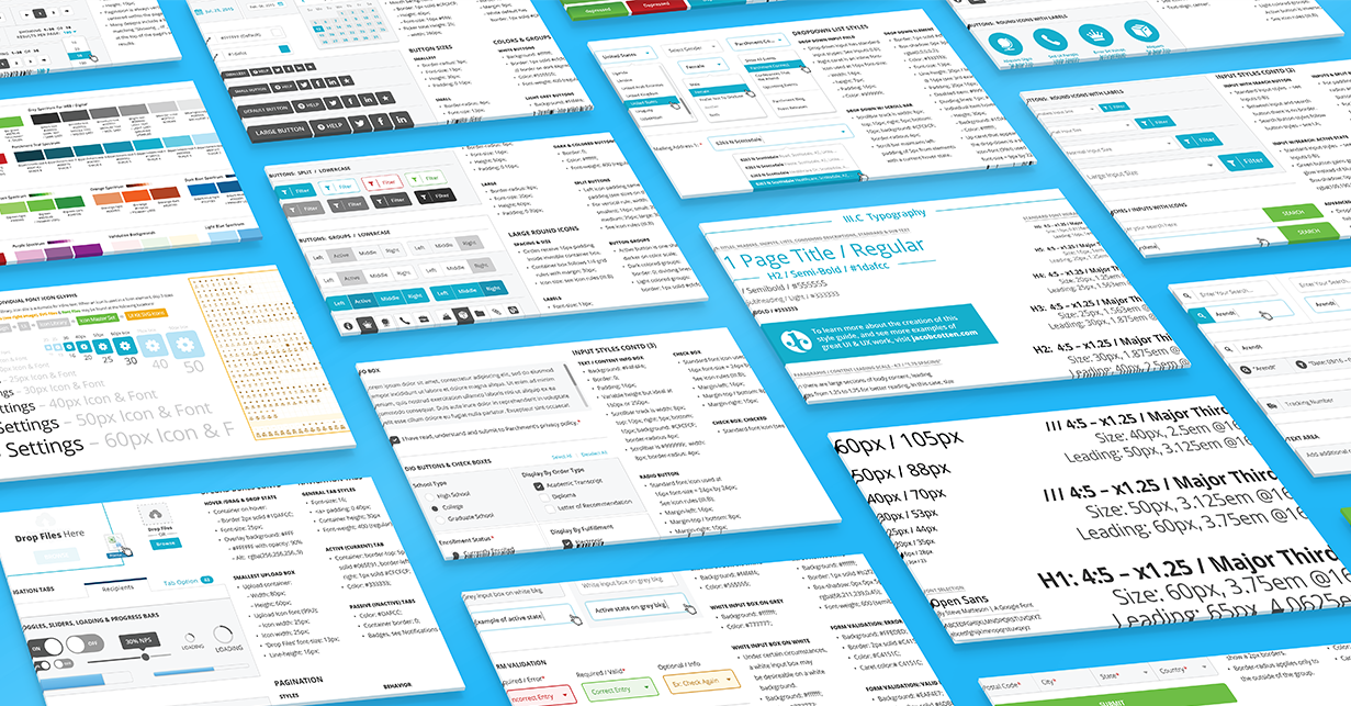
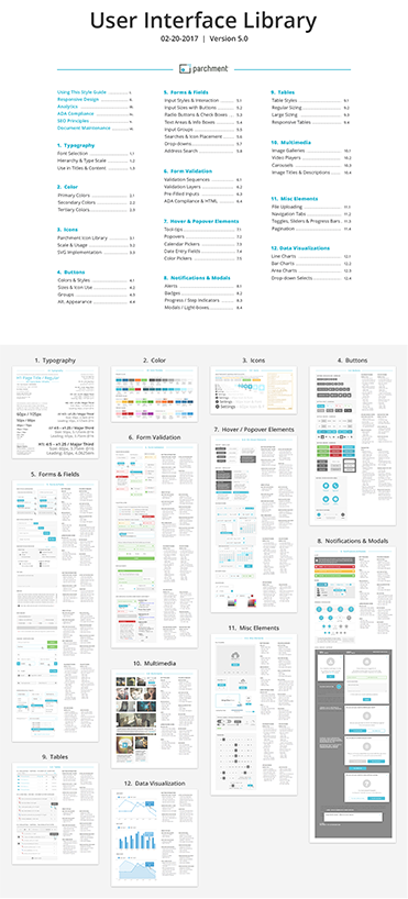
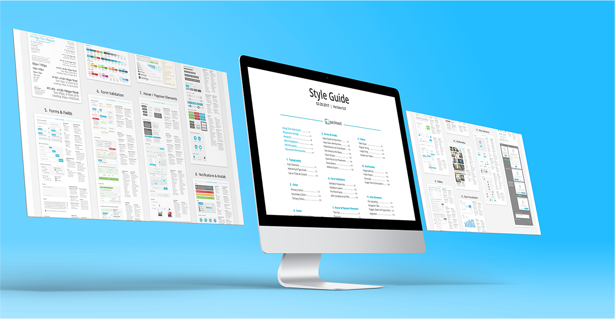
When I joined Parchment, they were juggling four products between with the consumer experience existing as an unofficial fifth. There was already a UI kit in place that defined key styles and components, such as buttons, fields, fonts and headers. Over the next two years, we would create two more products and expanded our existing ones, not counting concept work. During this time, we continued to add components until we had the following categories: Navigation, forms & fields, design elements, buttons, notifications & modals, tables and data visualization, multimedia, a huge array of misc. elements and document maintenance.
We also kept notes on implementation and behavior as well as expected CSS next to those elements in the photoshop file because it found its way into the digital portal (more info below).
Putting all of these in one Photoshop file (or Sketch, etc.) next to a handful of blank starting templates sped up our design process by a huge amount. How much? Hmm… Maybe 4x? We could create a concept flow that was mostly comprised of forms in a day that would have formerly taken a week or more.
II. Custom Icon Library
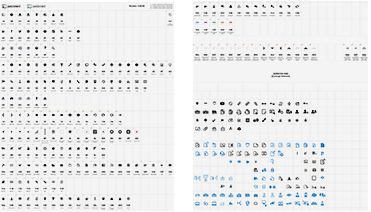
This might be a part of your UI Library. We chose to make it separate because custom icons were created in Illustrator, but we turned it into an Icon font using icomoon. We also exported individual SVG files for our marketing department that lived in a folder on Google Drive.
III. DIGITAL PORTAL USING INVISION
Only our designers touched the UI Library, but it was used to create the Digital Style Guide that existed as an internal facing portal for everyone else at Parchment to access all the pieces of our design system.
A lot of companies have created their own mini-sites, and that’s what Parchment had when I joined them. This was a nightmare because we had to subtract from user stories for developers to update our Design System. Which almost never happened. It was unmanageable. So we asked ourselves if we could solve this problem in a unique way.
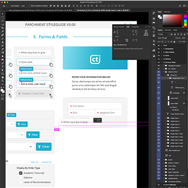
A popular online prototyping tool, InVision App has plugins to allow it to sync with both Sketch and Photoshop files. Because it's made to mimic website functionality, it made for a fantastic digital portal for hosting our design system with some simple hacks. On top of that, it has several additional tools that made our UI Library much more powerful:
- Invision will automatically generate flat mockups in a flow, meaning our UI Library was updated every time we saved the key photoshop file.
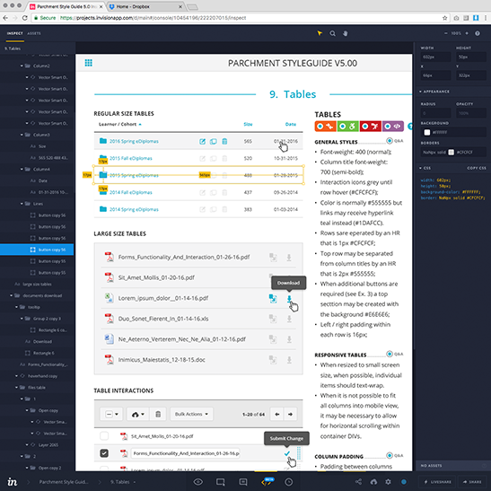
- The inspect tool allows anyone to hover over an element and it auto-generates some of the CSS styles, as you can see in the following thumbnail. It can also generate PNGs from embedded smart objects at double resolution.
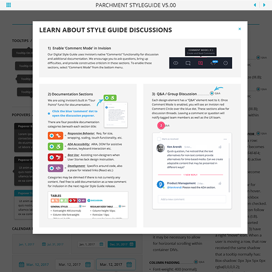
- The Comments tool allowed us to keep questions and discussion around UI elements in one place.
- Links to external files could be maintained by just drawing boxes around an itemized list. This is how our wider product team managed links to the React Pattern Library, Github documentation, Google Docs, and Google Drive resource folders.
- Already mentioned, but we could manage multiple levels of our UI Library by pretending it was a prototype.
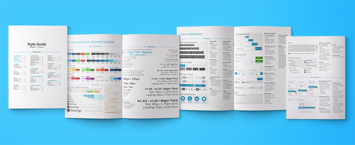
I’ll mention that we created the artboards in photoshop with the same dimensions as an 8.5 x 11 page so that everything could be printed. Once it was set up, this wasn’t really any extra work, but it did allow us to generate PDFs that could be sent to vendors by our marketing department with minimal design oversight. Also because people still print stuff.
IV. REACT PATTERN LIBRARY
This was separate from our UI Library because it was managed by a core team of 5 UI developers. Not everything in our UI Library (and therefore portal) was turned into a React component. Similarly, not everything in the pattern library was relevant or helpful to non-software engineers. Sorry, I don’t have any meaningful screenshots because we never look at it and it is managed somehow between Jira and Github (I’m sure your team has their own opinions).
V. DOCUMENTATION, SPECS & MISC INFO
- Brand and Corporate Identity: Originally created early on for our startup by a separate agency and composed of a brand book as well as language, purpose, and identity statements. While the brand book was referenced in creating our UI Library, it also contained additional references for creating other media such as video, collateral, and even an exceptionally large trade booth.
- Research: This big bucket includes user studies, marketing surveys, user feedback from our clients and help center, competitor analysis, and more.
- Personas: Because we had two separate but intertwined B2B and B2C components with multiple users on each side, we maintained a comprehensive set of personas that informed all of our product planning, flows, designs and language.
- Accessibility: This was an initiative I lead in my second year at Parchment, and I ended up creating an ~entire case study~ about it.
- Responsive Design Framework: This covered breakpoints, touch behavior, font scale, and a more in-depth look at the behavior for app-specific components such as our left menu nav panel.
- SEO & Analytics: While not technically housed exclusively in the design department, we also chose to address certain points related to language, code, and architecture for best SEO practices that would additionally impact product and marketing decisions.
Update, Summer of 2018
Two years later, so much has happened since I wrote this article! I’ve been a contractor and consultant for the last year since I left Parchment, and I still reference this all the time when discussing design systems with clients and other designers. Back when Ken Arendt and I were first making this design system for Parchment, we found few articles discussing the concept and even fewer outlining the process.
Today, I’m amazed at how much traction design systems have gained and how much has been written on the subject. Many major brands have publicly released theirs, including Atlassian, Airbnb, Mailchimp, Yelp, Buzzfeed, and Salesforce. At the same time, Google’s Material Design Apple’s Human Interface Guidelines are great examples of thought leaders that have carried the baton forward in astonishing ways.
Looking back at the Parchment Design System, given that UI and visual design are constantly evolving, I can say that these styles look a bit dated today. Even at the time we were defining them, we knew some of them were on their way out, and yet we still had strong constraints to work interchangeably with existing flows that couldn’t be updated at that time. That said, I’m still proud of the thought behind it and I still think another team might find this helpful as they think about creating their own design system as they go! I also hope that it makes it much easier for a future team to update those flows at Parchment when the time comes, and to remain brand consistent until then.
One more quick shoutout to Ken Arendt, the guy who made all this possible. I miss working with you, and I’m so grateful for everything we were able to learn from each other!
